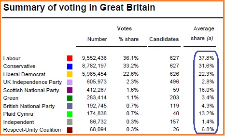
The chart is from Political Betting.com a good source of mostly unbiased material, money where mouth is does make peoples opinions more honest.
They used the chart to show the difference between vote share when spread across the whole of the country against only those seats fought between Labour and the Tories. But my interest went down the chart to the BNP see how the percentage rose from 0.7% percentage nationally, which the opponents of the BNP love to bang on about against the figure of 4.3% average across all 119 seats which the BNP fought, this average is 1.5% higher than that of UKIP.
You will also see if we could harness the nearly a million voters which we got out in the euro election. We would have a clear 4th place and I am sure be winning seats in the next election. The challenge is to get those voters out, the tools is reports like this, it is all in how you decipher and promote the figures, you can say the BNP only got less than one percent or you can promote that we were 6 times better than that.
if you take out the five percent of immigrants who would never vote bnp then the bnp will always be reported as a quarter percent lower then the real result for instants two thousand polled minus five percent equal 1900 voters divided by one hundred and times four equals 76 but four percent of 2000 equals 80
ReplyDelete